



Establishing a hierarchy of user intent
High-frequency trading (HFT) platforms require specific UX design best practices to prioritize data density without sacrificing execution speed. Users in this environment operate under extreme time pressure, meaning the interface must surface actionable information immediately. By categorizing user intent into primary, secondary, and tertiary tiers, designers can allocate screen real estate based on the necessity of the information for immediate trade execution.
Primary intent focuses on order entry, real-time price feed monitoring, and position management. These elements must occupy the central “golden zone” of the display. Secondary intent involves historical chart analysis and order book depth, which should be accessible via single-click toggles rather than nested menus. Tertiary intent, such as account settings or historical reporting, belongs in secondary windows to prevent visual clutter from impeding the trader’s reaction time.
Mapping critical path friction points
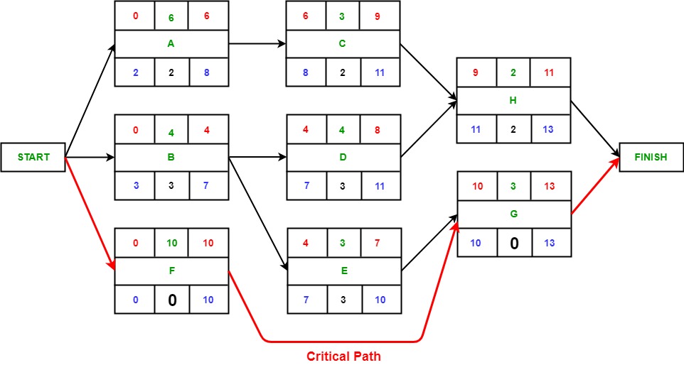
Identifying where users abandon transactions due to complex confirmation steps is essential for maintaining liquidity and user retention. In HFT, every millisecond spent navigating a modal window increases the risk of slippage. Designers should audit the trade lifecycle to pinpoint where friction occurs. If you are looking to optimize these workflows, consulting with a b2b ux design agency can provide the necessary expertise to balance speed with usability.
- Confirmation Modals: Replace multi-step “Confirm Order” pop-ups with “One-Click Trading” modes that utilize keyboard shortcuts or dedicated hardware triggers.
- Error Feedback Loops: Ensure that rejected orders display the specific reason—such as insufficient margin or price deviation—directly within the order entry widget rather than forcing the user to navigate to an error log.
- Input Validation: Use real-time validation for price and quantity fields. If a user inputs a value outside of the current market spread, the UI should provide an instant visual cue, such as a border highlight, rather than waiting for a server-side rejection.
By streamlining these critical paths, platforms reduce the cognitive load on traders. The goal is to minimize the distance between the intent to trade and the actual execution, ensuring that the interface acts as an extension of the trader’s strategy rather than a bottleneck.
Standardizing feedback loops for blockchain latency
High-frequency trading (HFT) platforms built on blockchain infrastructure face inherent latency challenges that traditional centralized exchanges do not. When a user executes a trade, the gap between the ‘submit’ action and the on-chain confirmation creates a high-anxiety window. Standardizing feedback loops is critical to ensure users do not perceive this latency as a platform failure or a frozen interface.
Effective feedback systems must transition from passive loading spinners to active, state-aware indicators. By providing granular updates—such as ‘Broadcasting to mempool,’ ‘Awaiting block inclusion,’ and ‘Finalizing transaction’—platforms reduce user uncertainty and prevent the common frustration of repetitive clicking.
Visual cues for pending transaction states
To prevent double-submission and accidental order duplication, UI components must undergo immediate state transitions upon user interaction. A ‘Buy’ or ‘Sell’ button should never remain in its default active state after a click. Instead, implement a three-tier visual feedback mechanism:
- Immediate Debouncing: Disable the trigger button instantly upon the first click. Change the button opacity to 50% and replace the text label with a localized loading state, such as ‘Processing…’
- Progressive State Indicators: Use a non-intrusive progress bar at the top of the trading module that tracks the transaction lifecycle. This prevents the need for intrusive pop-up modals that block the user’s view of the order book.
- State-Based Button Transitions: If a transaction fails, the button must revert to an ‘Error’ state with a clear, actionable ‘Retry’ label rather than remaining stuck in a loading loop.
These ux design best practices ensure that the interface acts as a reliable bridge between the user’s intent and the blockchain’s reality. By locking the UI during the confirmation phase, you eliminate the risk of race conditions where a user might attempt to submit a second order before the first has been registered by the node. Always prioritize clear, high-contrast color changes—such as shifting from a primary brand color to a neutral gray—to signal that the interaction is currently locked, providing a definitive visual boundary for the user.
Applying UX design best practices to security-sensitive inputs
High-frequency trading platforms demand a balance between rapid execution and extreme caution. When users input sensitive data such as private keys, API secrets, or destination wallet addresses, the interface must prioritize error prevention over speed. Designers should implement “friction-by-design” for high-stakes actions, requiring intentional confirmation steps that prevent accidental asset transfers or configuration errors.

Validation patterns for wallet addresses
Reducing the risk of asset loss through checksum validation and visual address formatting is a critical component of platform security. Users often copy-paste long alphanumeric strings, which are prone to clipboard corruption or “man-in-the-middle” malware that swaps addresses. To mitigate this, platforms must employ real-time, client-side validation that checks the address against the specific blockchain protocol before the transaction is even initiated.
- Checksum Verification: Implement EIP-55 mixed-case checksums for Ethereum-based addresses. If a user enters an address without the correct casing, the system should flag it as invalid immediately, preventing the transaction from proceeding to the signing phase.
- Visual Chunking: Display long addresses in groups of four or five characters (e.g., 0x71C7…89A2). This allows users to perform a quick manual verification of the start and end segments, which is significantly more effective than scanning a dense, unbroken string.
- Network-Specific Icons: Automatically display the logo of the detected network (e.g., Solana, Bitcoin, or Ethereum) next to the input field once a valid address format is recognized. This provides immediate visual feedback that the user is sending assets to the correct chain.
Beyond validation, the input field should never be a “black box.” If a user pastes an address, the system should provide a clear “Verified” state with a green checkmark or a “Warning” state if the address format is valid but the checksum fails. By treating input fields as active security checkpoints rather than passive text boxes, platforms significantly reduce the cognitive load on traders while simultaneously lowering the probability of irreversible financial loss.
Data visualization strategies for complex asset portfolios
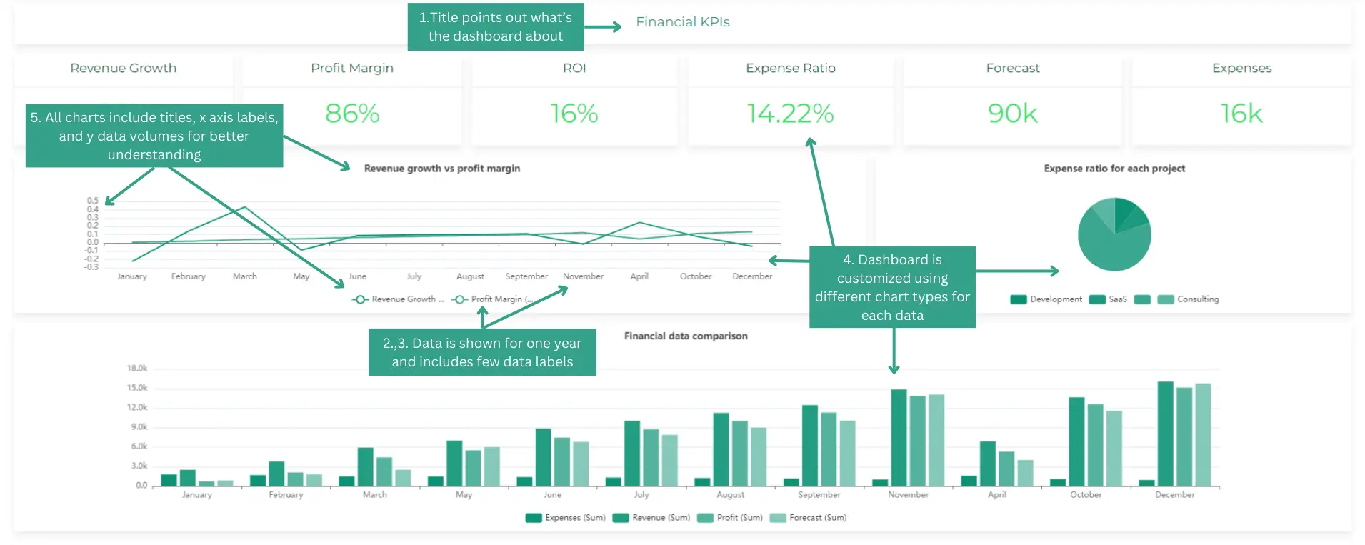
High-frequency trading (HFT) platforms demand immediate visual clarity to prevent decision fatigue. When managing complex portfolios, the primary challenge is balancing dense market data with actionable insights. Effective interfaces utilize high-contrast color palettes—specifically adhering to WCAG 2.1 accessibility standards—to differentiate between bid and ask spreads, order depth, and historical volatility. Avoiding excessive animations is critical; instead, use static, high-frequency updates that refresh in real-time without distracting the trader from execution tasks.
Progressive disclosure for advanced trading tools
Implementing progressive disclosure is one of the most effective ux design best practices for maintaining a clean primary interface. By default, the interface should display only essential metrics like current position, PnL, and immediate execution buttons. Secondary data, such as deep order book history, correlation heatmaps, or advanced technical indicators, remains hidden behind interactive elements like toggles, hover-states, or expandable drawers. For those seeking inspiration on modern layouts, reviewing web design trends can help in creating more intuitive dashboards.
This approach reduces cognitive load by ensuring that advanced tools do not clutter the workspace during rapid execution windows. For instance, a trader should be able to click a specific asset ticker to trigger a modal containing a detailed depth-of-market (DOM) view, rather than having that data occupy screen real estate permanently. This modularity allows the platform to scale from a simplified view for rapid monitoring to a comprehensive dashboard for deep-dive analysis without requiring a page reload or context switch.
When designing these interactions, prioritize low-latency feedback. If a user requests additional data, the transition must be near-instantaneous to match the speed of the market. Use skeleton screens or subtle loading indicators if data fetching exceeds 100ms, but ensure that the core trading buttons remain responsive and accessible at all times. By isolating complex data sets, you protect the user from information overload, allowing them to focus on execution speed and risk management.
Quality assurance checklist for interface deployment
High-frequency trading (HFT) platforms demand extreme precision. Before pushing any UI update to production, teams must validate that latency-sensitive components and data visualization modules function under stress. A robust QA process prevents minor interface bugs from escalating into execution errors during periods of high market volatility.
Accessibility and responsive testing criteria
Ensuring the interface remains functional across mobile devices and screen readers is a core component of modern UX design best practices. While professional traders often utilize multi-monitor desktop setups, the ability to monitor positions or execute emergency liquidations via mobile remains a critical safety feature. Testing must confirm that data tables do not break layout integrity when scaled down and that screen readers can interpret real-time price tickers without overwhelming the user with constant updates. If your team is struggling to meet these standards, it may be time to partner with design agencies leading the industry in high-performance interface development.
- Viewport Stress Testing: Verify that interactive charts maintain their aspect ratio and touch-target accuracy on devices ranging from 5-inch smartphones to 32-inch ultrawide monitors.
- Keyboard Navigation Audit: Ensure every order entry field, cancel button, and market depth toggle is reachable via keyboard shortcuts. This is vital for traders who rely on speed-optimized input methods rather than mouse clicks.
- Color Contrast Compliance: Validate that all text, status indicators (e.g., ‘Order Filled’ vs. ‘Rejected’), and trend lines meet WCAG 2.1 AA standards. High-contrast modes are not just for accessibility; they reduce eye strain during extended trading sessions.
- Latency Feedback Loops: Test that loading states and skeleton screens appear immediately upon data requests. If a websocket connection drops, the UI must provide clear, non-obstructive visual cues that the data is stale.
Beyond standard functional testing, perform a ‘cognitive load’ audit. Remove any non-essential UI elements that trigger during high-volatility events. If a user cannot identify their net exposure within three seconds of glancing at the dashboard, the interface requires further simplification. Use automated regression suites to confirm that new feature deployments do not inadvertently disable existing emergency kill-switches or override user-defined risk parameters.
Frequently Asked Questions
Primary goals of UX design in high-frequency trading
The primary goal is to minimize the time between data perception and execution. This involves reducing latency, streamlining order entry workflows, and ensuring critical information is prioritized to prevent decision fatigue.
Measuring the success of UX improvements in trading apps
Success is measured through quantitative metrics such as ‘Time to Order’ (TTO), error rates during high-volatility periods, and the reduction of clicks required to execute a trade. To see how top firms are achieving these metrics, you can explore the latest design agencies year over year to benchmark your platform’s performance.


